Pantone, the “world renowned authority on colour” recently announced its ‘2016 Colour of the Year.’ In a break from tradition, Pantone named ‘Rose Quartz’, a soft, warm shade of pink and ‘Serenity’, a cool, tranquil blue as their Colour of the Year.
The colours represent a complete departure from 2015’s ‘Marsala’, an elegant, earthy, wine-red hue. According to Leatrice Eiseman, Executive Director at the Pantone Colour Institute, the colours were selected in response to a global shift towards mindfulness and wellbeing and act as an antidote to modern day stresses. Combined, Rose Quartz and Serenity reflect connection and wellness as well as a soothing sense of order and peace explains Eiseman.
“Appealing in all finishes, matte, metallic and glossy, the engaging combo joins easily with other mid-tones including greens and purples, rich browns, and all shades of yellow and pink. Add in silver or hot brights for more splash and sparkle,” adds Pantone.
Appealing as Pantone’s selection may be, Dave Nemeth, head of trend forecasting and consultancy company Trend Forward says the colours are not particularly ground breaking and err towards the “safe” side.
Notes Nemeth: “Pantone’s Colour of the Year represents a move away from the distinctive and daring and a shift towards a more placid palette. What’s more is that these colour pairings have actually done the rounds before in the form of the baby blue and dusty pink fondant colours which were so popular just a few years ago.
“In my opinion the colours actually go against what’s trending. This year, earthy tones and copper, black and white combinations are very much in vogue which can be used across the seasons and across both men and women’s fashion lines with ease. It may be difficult to integrate Rose Quartz and Serenity with such ease, especially into winter palettes.
“That said, Rose Quartz and Serenity are what you might call universally appealing colours which will fit in well with many people’s existing neutral colour schemes. They will also look good when combined with coral and peach tones.
Adds Nemeth: “I fully expect most retailers to do what they have always done and create collections featuring these colours. They will translate well into tableware, fabrics, ceramics, upholstery, makeup and lingerie and will no doubt be picked up by most women’s magazines. Whether or not interior designers will hang their hat on these colours and incorporate them to a large extent in their projects remains to be seen.”
For those who love the colours and want to incorporate them into their homes, consider the following tips which were recently shared by Liza Watermeyer, Retail and Display Coordinator at Tile Africa.
The bathroom:
Watermeyer says that Rose Quartz and Serenity can be incorporated into the bathroom through the use of accessories such as towels, bathroom mats, soaps and candles in one or both colours. The look can be rounded off with a pot plant in a Rose Quartz or Serenity coloured container.
The bedroom:
Throws and scatter cushions lend themselves to Pantone’s Rose Quartz and Serenity says Watermeyer who adds that neutral curtains trimmed in these colours also work well in the bedroom. As for what materials work best, she says silk, linen and mohair bring out the best in Pantone’s colours.
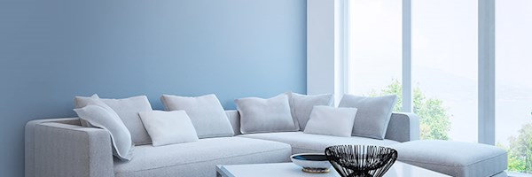
The kitchen and living areas:
In line with Nemeth’s comments, it’s not hard to find Rose Quartz and Serenity coloured appliances and kitchenware. As such, it should be relatively easy to incorporate Pantone’s colours into your kitchen should you feel so inclined. As for living areas, Watermeyer suggests incorporating the colours through the use of subtle frames on white walls and select objects such as occasional chairs and artwork.