We are all craving balance, a closer connection to nature, fun in the sun and hope for the future. These cravings affect the colours we are drawn to, which is why earthy colours are so hot right now. The good news is, trends are lasting longer as the colours become more flexible and individuality is celebrated. Let your personality shine and make your home fabulous with these hot shades and patterns of summer.
Shades of Terracotta
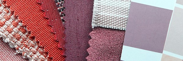
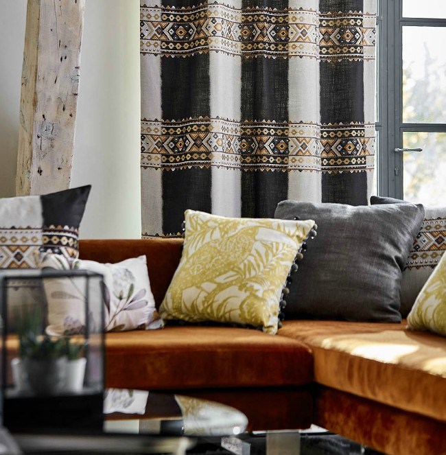 Image: Black Fabrics
Terracotta translates to "baked earth" and from rustic paving to the catwalks, terracotta has never been hotter. Terracotta is neutral enough to work with a range of colours. Spice up a black and white scheme with a velvet terracotta couch or touches of terracotta which will warm up the space. Consider touches of terracotta in your curtains, the Bora Design from Black fabrics shown above has a beautiful embroidered horizontal stripe representing an ethnic braid.
In colour psychology terracotta is associated with creating a warm, welcoming and nurturing atmosphere.
Tips on using Terracotta
• Materials rich in texture like warm woods, sisal, wool and velvet enhance the scheme giving it a sophisticated yet homely feel.
• A warm terracotta scheme can be cooled down by adding some complementary blue or green.
• Terracotta comes in many shades, select a shade that ties in with the rest of your scheme.
Shades of Mustard
If you are a fan of Instagram or Pinterest your will have noticed an influx of mustard yellow - or as it is now being called, Gen Z yellow - in fashion and interiors. Bright, positive and attention grabbing as this new Damask wallpaper by Zoffany highlights.
In colour psychology yellow is one of the most uplifting colours in the spectrum. It brings feelings of hope, an air of radiance and cheerfulness. It is linked to confidence and the intellect. Yellow stimulates our brain expressing our need for knowledge and to see things more clearly.
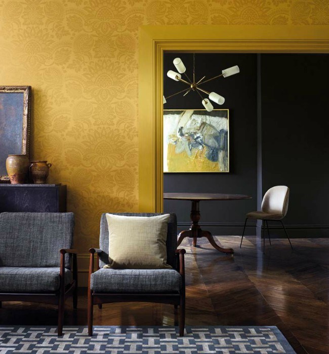 Image: St Leger & Viney
• Make a bold statement with a striking wallpaper like the new Pomegranate damask wallpaper by Zoffany available from St Leger & Viney
• Mustard is a vibrant colour and can be overpowering in a room, introducing dark neutrals will soften the look and ground the scheme.
• Avoid using yellow in rooms where relaxation is your priority for example bedrooms and bathrooms.
Shades of Pink
Pink has grown in popularity over the past few years and has even earned it own nickname - millennial pink. Cast your mind back to Pantone's 2016 Colour of the Year 'Rose Quartz" and you might think pink has had its moment in the sun, but this gorgeous, fun loving and carefree colour is not going anywhere. Candy-coloured and baby pinks have grown up to become more gender neutral, chic and sophisticated.
In colour psychology pink energy relaxes the muscles and calms the mind. It signifies tenderness and tranquillity. Pink brings an air of optimism and happiness, it's like looking at the world through rose tinted glasses.
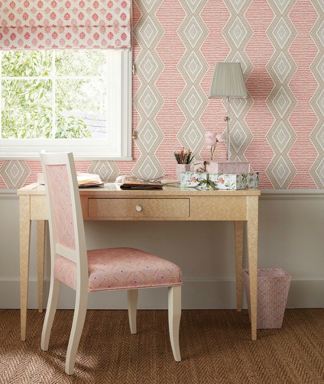 Image: Nina Campbell
• Add a touch of romance to an interior with Matisse inspired, hand painted, patterned fabrics and wallpapers from Nina Campbell.
• To avoid an overly feminine space and add sophistication, combine the pink pattern with solid neutral paint colours - Duram Muted Air E207-1 - and natural wood flooring and furniture.
• The complementary colour is green, these two colours work beautifully together and this combination is a big interior trend right now.
• Pink helps bring a healthy glow to complexions so it's ideal for bedrooms and bathrooms.