A monochromatic colour scheme makes a room look elegant, calm and cohesive. It is created when tints and shades of one colour family are used in a room or space. By purposefully working within one colour family you have a thread that ties a scheme together and a sense of unity is created.
When a monochromatic scheme is done well, it creates an uncluttered and calm harmony. It is most often used in neutral and minimalist decor schemes. The downside of a monochromatic scheme is that when all design elements and colours in a scheme look similar to each other, there is a chance the room can look boring. To prevent this and ensure your design is visually interesting as well as streamlined, here are some tips to pull off a monochromatic colour scheme successfully.
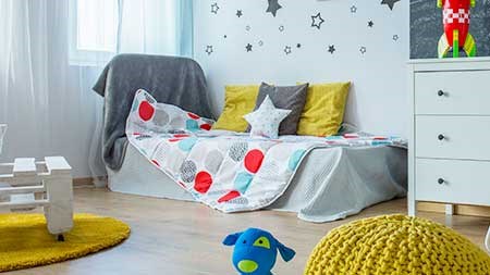
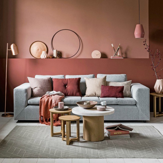 image: www.home-oka.com
Select your colour palette
The first step is to decide on the colour family you wish to work with. Select tints (colours with white added) and shades (colours with black added) of that colour palette for your scheme. It is advisable to create and work off a mood board, or you may have an art piece, rug or fabric as inspiration.
While there are no rules to number of colours you should use, it is recommended that you find three or four colours to create an interesting scheme. Select one key shade which will be used as a base to define the scheme, then choose a darker shade of that colour as well as a lighter tint.
If unsure, you can get a good idea from the paint swatches in store, many have swatches with tints and shades of a single colour on the same card. While this is a good guide, you may wish to use tints and shades which are more muted than your base shade. This is perfectly acceptable. Use your inspiration as a guide when selecting the colours.
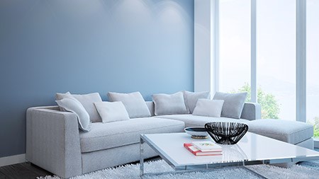
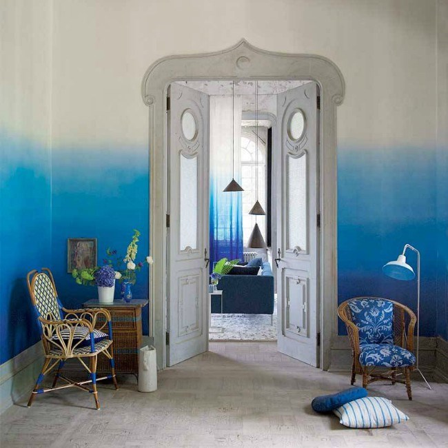 Image: voguelivingmagazine.com
Including texture and pattern in your monochromatic scheme is critical in creating a successful and visually interesting scheme. Consider, for example, combining luxurious fabrics like silks and velvets with raw and unfinished wood items. Add some rough texture like a sisal rug together with soft wool cushions.
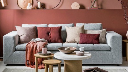
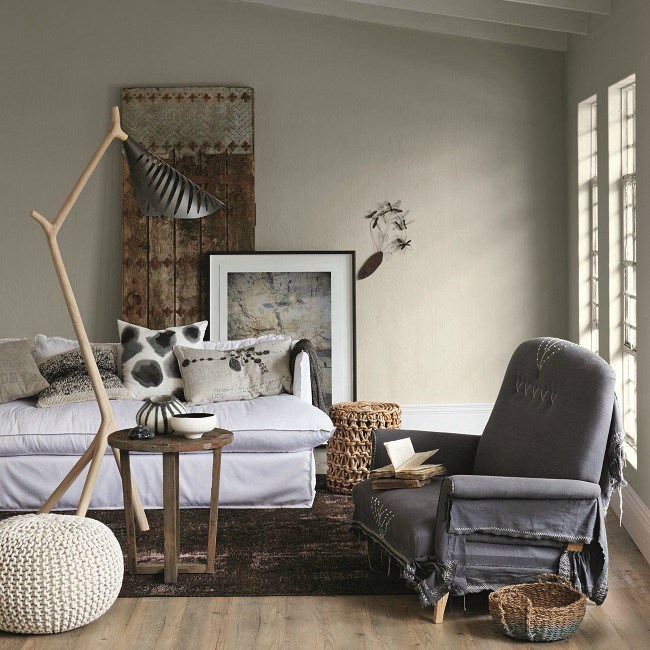 image:plascon.co.za
As a general rule 60% of your scheme should be your main colour, this is usually the colour of your walls as the biggest space. 30% of your scheme is your secondary colour in a slightly lighter or darker shade - this would include for example, furniture, curtains and/or floors. The last 10% is for accessories, cushions, lamps, art objects, vases or perhaps a feature wall. This is an opportunity to add some creative flair. You may like to add a touch of glamour by including some metallics in your scheme.
This is also an opportunity to break the rules a bit, so if need be, add another colour like green for example, to link the scheme to nature and help balance the scheme. Green is also regarded as a neutral these days.
Playing with tints and tones of the same colour is a great way to help you streamline your design and create a common thread in your room, giving you a considered and professional look.
For more information on the other colour harmonies you can create, visit Creating Colour Harmonies - 6 Classic Colour Schemes