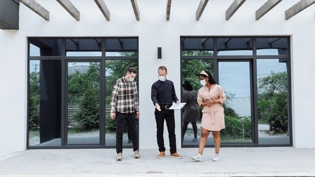
Mobile devices are being used more and more every day. According to Google, mobile property searches have more than doubled in the past year.
Many months ago we created a mobile website that generated a mini version of our website, which was more usable on smaller screens like those on cell phones and tablets.
Times are moving along and now we have amazing iPhone and iPad apps (downloadable from the app store) but we really wanted to create amazing user experiences for you, no matter the devices you use.
In an industry-leading move we have created a “responsive” version of our website.
This means that when you navigate to www.privateproperty.co.za our website recognises your device’s screen size and responds by giving the best possible version of the site for that device.
Aspects like changing the resolution and repositioning buttons all happen automatically and this gives you custom experiences for all your devices.
You now don’t have to go to our mobile site but can enjoy a customised experience seamlessly from www.privateproperty.co.za.
It is likely that you won’t even notice the little differences. But you’ll definitely notice your overall experience improving dramatically.

