For all you trend-watching décor enthusiasts out there, the Pantone Colour Institute has announced their colour trend for the year ahead – the all familiar and ever comforting, Classic Blue.
Since 2000, the Pantone Colour Institute has dedicated itself to the reviewing and researching into current and global trends across many disciplines before settling on what they deem to be their “Colour of the Year”. Their choice is then announced at the end of the preceding year and aims to reflect current trends in architecture, interiors, décor, nature, fashion and food to name a few! This year they’ve opted for a nostalgic yet familiar shade, Classic Blue.
A far cry from the freshness and vibrancy of Living Coral – 2019’s Colour of the Year, Classic Blue is a well-known shade that is already widely loved and used in décor and design across the world. Described by the Pantone team as enduring and timeless, Classic Blue is “elegant in its simplicity.” Inspired by the sky at dusk, it promotes a sense of reassurance and, “highlights our desire for a dependable and stable foundation on which to build as we cross the threshold into a new era.”, according to the Institute. Laurie Pressman, Vice President of the Pantone Color Institute, further adds that Classic Blue is a reassuring blue, “full of calm and confidence”. She went on to say that the Institute chose this shade as they felt that it was a resilient colour that highlighted dependability, trustworthiness, credibility, and constancy, all traits that are valued in the fast-paced, high-stress situations of the current world.
With all this in mind, it’s not surprising that most of us might be interested in incorporating some part of Classic Blue into our lives. According to experts, the colour is hugely adaptable – an “all-rounder” in many different ways – given its versatile use across many different materials, palettes, textures and finishes. So, with so many options, where does one start? If you’re asking that question, fear not! We’ve done our homework and here are four simple ways to bring Classic Blue home for yourself this year:
Make it pop
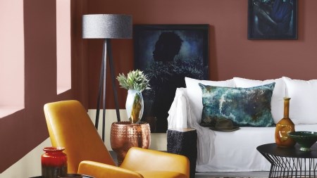
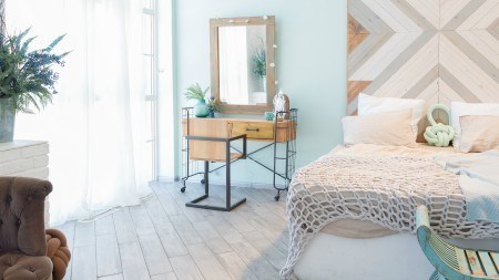
Chosen in part for its versatility, Classic Blue can be easily added to any space in (mostly) any form. Use this to your advantage and opt to use it as a splash or pop of colour throughout your home. This can be done through the use of décor accessories such as accent rugs, couch throws, scatter cushions and ornaments. In the bathroom or bedroom, towels or sheets can be used to include Classic Blue. Take making things pop one step further by incorporating accessories in complimentary shades of blue and other colours such as olive greens, golds or amber.
Turn your appliances into accessories
It’s amazing how much of a difference a change-up in appliances can make to a space – even if that’s the only change made. Décor experts therefore encourage boldness when incorporating this colour into the appliances and crockery currently hiding in your kitchen. Put that Classic Blue casserole dish on display or splash out on a fancy, Classic Blue inspired appliance if you can. One thing is for sure; by looking for Classic Blue appliances or crockery that lend themselves towards being décor pieces, you’re sure to keep cool, calm and collected in style - no matter what the heat in the kitchen!
Be playful with lighting
Bringing a trend like Classic Blue into your home doesn’t have to be daunting! In fact, experts suggest that Classic Blue challenges this very notion with its innate sense of safety and comfort that should inspire you to be playful and think outside the box! That said, don’t be afraid to take a run at the lighting options in your home. Make a statement with a standing lamp or ornate lamp shade in Classic Blue to bring in a soothing and calming touch to any room. Furthermore, candles in the colour could add another dimension of peace and relaxation to your home’s ambient lighting.
Refresh the old
Finally, as noted by the Institute, Classic Blue will always conjure up feelings of familiarity and nostalgia. According to them, Classic Blue instils a sense of “the classics” and reminds us of the simple beauty of the past. That said, the focus is not on repeating the past but rather on reinterpreting it. With this in mind, re-purposing or refreshing old décor in Classic Blue is one of the best and most appropriate ways to celebrate this much loved favourite.
For most, Classic Blue will always be synonymous with rest, peace and tranquility – a feeling much needed and desired in many homes today, given the state of the world. We cannot be blamed for wanting to seek the peace and comfort of familiarity and reassurance – especially in our homes and sacred spaces. If that’s what you’re after, then Classic Blue truly is the way for you to go in 2020.