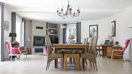
During the Covid-19 pandemic, home design choices largely revolved around creating feelings of stability and calm, with comforting neutral colours and cosy soft furnishings to surround ourselves. However, now that the world is slowly resurfacing - with feelings of hope and positivity for the future - brighter and more optimistic colour combinations are becoming more evident throughout the home.
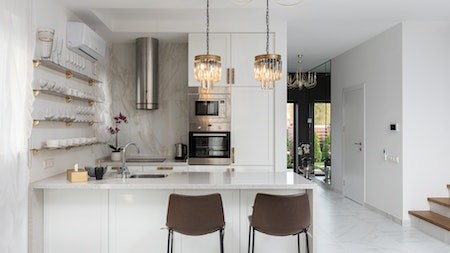
The kitchen is no exception. Instead of neutrals and pale pastels, there is a move to introduce a broader colour palette in this space with colourful appliances, painted walls and accessories. In addition, kitchen designers are introducing attractive new shades for cabinets and furniture, creating modern and playful spaces.
Designers are also experimenting with prints and patterns. These can be retro, traditional or modern, neat and straightforward or bold and busy.
Colours
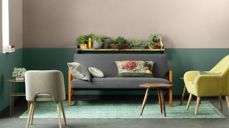
Green and blue in all shades are on trend this year. You can use them separately or together to create the look and feel that best reflects your lifestyle.
A popular choice is teal - a deep blue-green colour, similar to cyan but darker. From bold and bright to soft and subtle, teal is popular in all rooms of the home. It has a lower saturation than green or blue, making it easier on the eye. According to the Interior Designers Institute (IDI), teal mixes the tranquil stability associated with blue colours into green hues' optimism and healing properties, creating a revitalising mood. Undoubtedly ideal for any kitchen.
As with almost any colour, too much teal can be overwhelming.
Fortunately, several colours combine well with teal to maximise its positive effects:
- Beige offsets the coolness of teal, and black is an ideal match if you want to create a more dramatic effect.
- Brown works well with softer shades of teal – particularly on the blue side of the spectrum.
- Cream paired with teal creates an elegant colour scheme that highlights the cyan hues.
- Gold with teal creates a luxurious and sophisticated feel.
- Grey is a cool neutral that will make teal pop.
- Pink – pale or bold - is an exciting pairing for a colourful space.
- White with teal is ideal for a modern kitchen theme.
- A range of yellow hues can work, depending on the shade of teal. Try out yellows from mustard to chartreuse – a shade between yellow and green.
- Burnt orange also works well, especially if you include softer peach or apricot tones.
Patterns
Bold and stylish splashbacks are taking the front seat when it comes to prints and patterns.
Splashbacks help protect walls from cooking splatters and prevent steam and heat from damaging the wall behind the hob or washing area. In addition to their practical value, kitchen splashbacks now make a strong style statement.
Although you need to choose a waterproof material, easy to wipe clean - and heatproof if you are using it behind the hob - that doesn’t mean you should compromise on aesthetics. Splashbacks are perfect for experimenting with playful patterns and new trends because they are easier to update than kitchen cabinets or an entire wall.
Tiles are the typical choice for splashbacks, and alternative materials include glass, granite, marble, quartz, engineered stone and stainless steel.
- Glass splashbacks in bold, striking colours will create a strong contrast in a neutral kitchen.
- A marble panel adds a touch of luxury.
- Match your splashback and your kitchen work surface. This works best with a smooth material such as marble.
- Exposed bricks can create an industrial finish that is cool and contemporary and can be painted to match your kitchen colour scheme. Be sure to seal them properly.
- Patterned tiles help add a splash of colour and personality to a neutral kitchen. Pick a pattern in a contrasting colour to the rest of the kitchen.
- Black and white diagonal stripes between hob and extractor create a strong focal point without being overpowering.
- A mosaic tile design doesn't need to be fussy. Choose small tiles in a simple colour scheme, and use grouting one or two shades darker than the tiles.
The message from designers in 2022 is to be bold – and don’t be afraid of introducing colour and patterns into the kitchen.