Did you know that in the 15th Century it was traditional to get married in a green wedding dress? That’s because green was the colour of fertility. Today the bride is almost always in white, which connotes purity.
While traditions change over the years, what remains constant is that we attribute certain meanings to specific colours. Even if it’s subconscious, colour has a psychological effect on us. So if you’re choosing out colours for your wall paint, furniture or linen, it wouldn’t hurt to put a little thought into the colour you choose and the mood you want to create.
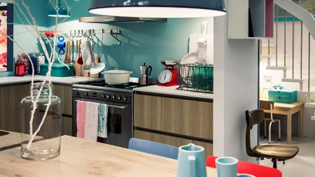
Green
Seeing as we were on the topic of green, we’ll start there. Green is connected with tranquillity, health and money. All lovely things to have, so feel free to be generous with your use of green. It’s even been suggested that those who work in green environments suffer fewer stomach aches.
Yellow
Yellow is the colour of a radiant sun and cheerful daffodils. It conveys energy, optimism and happiness. However, even though it’s a popular choice as a gender-neutral colour, don’t paint your entire nursery yellow because apparently it makes babies cry. Perhaps yellow is a stimulating colour, and overly-stimulated babies cry more.
It seems that while yellow is fun and uplifting in small doses, it’s not something you want too much of. Keep yellow as an accent colour, rather than dousing a whole room in the cheery hue.
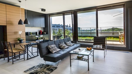
Blue
For some reason, blue is for boys and pink is for girls. This is a bit strange, because blue isn’t particularly associated with masculinity, but with serenity and peace – perhaps because of its association with calm waters (never mind the fact that water can also be stormy).
Feel free to defy gender stereotypes and paint your little girl’s room blue. When she’s older she’ll probably resent a girly pink room anyway. Blue is the most popular colour choice for offices, because it apparently facilitates productivity.
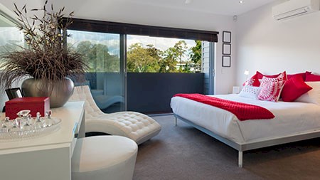
Red
On the other hand, red would be the worst colour to have in the office. It can stir up anxiety and hinder performance. Best keep it to a minimum in the bedroom as well then. Red is passionate and explosive, the colour of cupid hearts and warning signs.
Like yellow, red is best kept as an accent colour. If you like the idea of a romantic bedroom, you could have a soft cream wall colour, with accent pieces like red blankets or pillows.
A place where red is often used though is in chain restaurants - think of MacDonald’s and KFC. This is because red apparently raises your pulse, thus making you want to eat faster and hence more.
That’s odd …
As interesting as this colour psychology is, different cultures attribute different, even contradictory meanings to colours. For instance, while in the West we think of yellow as being bright and cheerful, in Greek culture it reflects sadness.
Therefore, the meaning we attribute to colour isn’t inherent to the colour itself, but more to our backgrounds and even just hearsay. This basically means that if you like a colour, don’t worry too much about what it apparently signifies. The meaning you personally get from it is enough. Colour psychology is however a good place to start if you’re completely clueless about what colour schemes to choose for your décor needs.